P99 CONF 2023 is now a wrap! You can (re)watch all videos and access the decks now.
ACCESS ALL THE VIDEOS AND DECKS NOW
Editor’s note: The following is a post from Tanel Poder, “a long-time computer performance geek.” He spoke at P99 CONF 23 on “Always-on Profiling of All Linux Threads, On-CPU and Off-CPU, with eBPF & Context Enrichment.” Watch his talk to discover a new open source eBPF tool for efficiently sampling both on-CPU events and off-CPU events for every thread (task) in the OS. This article was originally published on Tanel’s blog.
Introduction
Brendan Gregg invented and popularized a way to profile & visualize program response time by sampling stack traces and using his FlameGraph concept & tools. This technique is a great way for visualizing metrics in nested hierarchies, what stack-based program execution uses under the hood for invoking and tracking function calls. If you don’t know what FlameGraphs are, I suggest you read Brendan’s explanation first.
In this blog post I won’t be doing traditional stack profiling, but will apply FlameGraphs in a new way for visualizing Oracle Database SQL execution plan metrics. This visualization is not limited to Oracle only, it can be used on any RDBMS engine, as long as the engine reports actual time taken at execution plan operator (plan line) level.
Even though FlameCharts could be used for visualizing any cumulative metric (like amount of I/O generated in different stages of the plan), in this post I will measure what matters the most — the response time used by individual execution plan operators. I’m using Oracle’s DBMS_XPLAN with the statistics_level=all setting for the examples in this post.
Current State of SQL Plan Visualization (Oracle & Postgres examples)
It’s worth mentioning that the Oracle Database already has great instrumentation and pretty good visualization of its execution plans. Here’s an example plan of Query 72 of the TPC-DS benchmark (11-table join) visualized as a tree using the Oracle’s Real-Time SQL Monitoring tool:
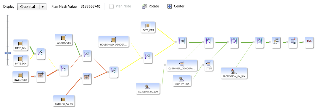
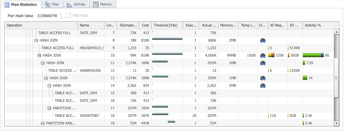
The tree gives a high level overview of the execution plan hierarchy, but doesn’t have a good way for visualizing which plan nodes or branches took the most time to run. The tabular view below has lots of additional performance metrics (and that’s where I spend most of my time when doing Oracle SQL tuning). For example, the last, Activity% column tells you exactly on which plan line most of the time was spent. However, this layout has a shortcoming, your plan may be way too large to fit on one screen. Lots of scrolling back’n’forth is needed with large plans, trying to remember whatever was shown in some other section of the plan.
Here are couple of current Postgres plan visualizer examples that provide useful details and emphasize where in the plan to focus:
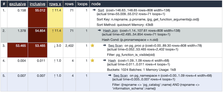
^ Tabular layout and heatmap visualization of Postgres plans by explain.depesz.com.
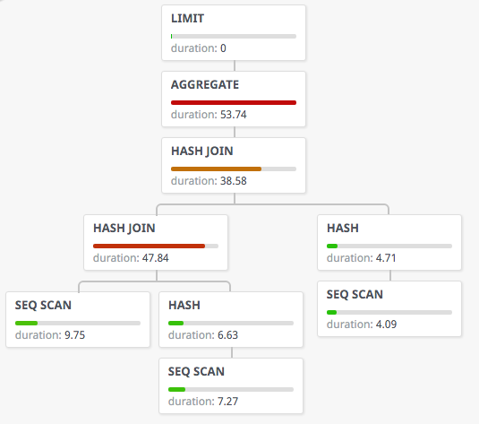
^ Tree layout with Postgres plan node self-time usage by tatiyants.com/postgres-query-plan-visualization.
Both the tabular and tree layouts have their strengths and weaknesses, but in my experience both of them become troubleshooting bottlenecks with very large plans when trying to understand the plan structure and its resource usage at a glance. By very large plans I mean SQL execution plans that have hundreds, or thousands, of operators in them as you’d typically see in enterprise ERP databases and complex data warehouse systems.
Also, you don’t get always lucky and find a single plan operator or a branch that uses 95% of your response time, sometimes the performance problem starts from a much higher level driving operation that causes many plan lines deep in distant locations to use a small amount of the resources each, totaling up to a bigger problem.
So I’ve been thinking of additional ways for visualizing very large plans that would give a good high level plan overview at a glance, ability to understand parent-child-grandchild relationships through many plan layers and at the same time show the resource consumption of all plan operators too.
Introducing FlameGraphs for SQL Performance Visualization
Conceptually, at high level, you can compare Oracle or Postgres SQL plan execution to how a regular program makes function calls. A driver function main() calls do_something(), that function delegates work further, calling get_item() etc … once the get_item() function gets what it wants, it returns control back to the right location in its calling function do_something() (with the help of stack), who may then call some other function, return or just loop back and call the get_item() function again. This is how programs work.
The Oracle RDBMS engine does the same at high level, when executing plans. A SELECT STATEMENT (data fetch) operator may call a NESTED LOOPS join operator under the hood, who then calls INDEX RANGE SCAN operator, who then calls some low level C functions to extract data from some buffers in the cache. The INDEX RANGE SCAN then returns control back to the parent NESTED LOOPS operator with the help of stack, who then may decide to access the other table involved in the join or loop back and invoke the same INDEX RANGE SCAN again (to fetch another batch of data).
So, a regular application with C functions or Java methods invoking subroutines at low level is very similar how the Oracle RDBMS execution plan operators invoke “child rowsources”. Therefore you can use the existing FlameGraph toolset to visualize SQL execution plan performance without modifications.
Oracle can report how much time was spent in each execution plan operator depending on the method, either the absolute “self-time” value or a cumulative value that includes all child operators in the execution plan tree. With some recursive calculation logic (easy to do in SQL) we can generate data that the FlameGraph.pl tool can use. I will explain the flow later, but here’s a FlameGraph of the same 11-table join execution plan previously visualized with Oracle’s tools above:
You can open the above image — and the flamegraphs below too — in a new tab to get into the interactive SVG mode and click/move your mouse over the plan lines, zoom in and see the cumulative response time values (in milliseconds) in the bottom of the chart.
What’s the value of FlameGraphs for SQL?
Your RDBMS engine may already have some visualization tools of execution plan structure. Fewer RDBMS engines have visualization of not only the structure of the plan tree, but the actual response time used by previous execution(s). As I showed above, Oracle can provide quite a lot of metrics for every SQL plan operator, but the tabular plan output with performance metrics doesn’t always work well with very large plans. The “parent operator” of an execution plan line may be multiple pages of scrolling away or the resource consumption is spread across many “distant” locations in the execution plan tree.
SQL FlameGraphs complement such low-level views with excellent high level overview, allowing to see parent-child relationships visually close together and the cumulative response time (or whatever other metric plotted) as the width of the “flame bar” in the same place.
And thanks to how Brendan has built the SVG generator, we can even click on individual areas (SQL plan tree branches) and zoom in to the interesting parts. Typically the widest parts are most interesting here though as the more we “shrink” the width of an operator via some optimization, the faster it will run!
Here’s an annotated example that shows most of the response time being spent on plan node 10 - HASH JOIN:
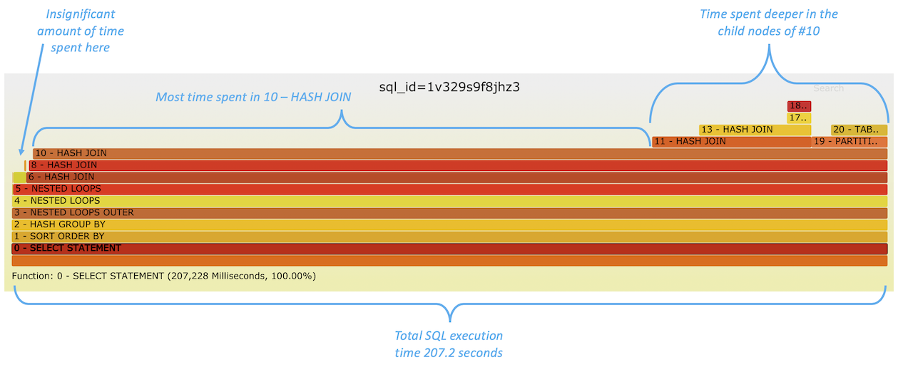
As the line 10 (and lines 11, 19 “deeper under” it) take most of the width of this chart, it’s evident that most of the response time is spent somewhere in “#10 and deeper”. For example, I don’t need to focus on lines 1 - SORT ORDER BY and 2 - HASH GROUP BY as they don’t add any additional width to the flamegraph, so there’s no noticeable additional execution time spent in them on top of whatever their child operators are consuming.
In fact, we can visually identify how much time is spent specifically within 10 - HASH JOIN (self-time) vs. cumulative response time coming from its child operators. I know that most of the plan execution time was spent within that hash join (and not in reading data blocks from a table or index) as it’s the widest line of this chart that does not have any layers on top of it. So this operator 10 was effectively active, doing its hashing, joining and perhaps spilling-to-disk I/O without waiting for work delegated to its child operators to complete.
As a starting point, one option for making my SQL complete faster would be to look for making this hash join itself faster (likely by either allocating more memory for this join or finding ways to send less data to this operator to process). This would require us to understand more detailed metrics, like number of rows processed and amount of hashtable spill I/Os done, than this high level FlameGraph visualization shows. It is possible to append some key metrics as plain text into the plan operator names themselves as I have done with table/index names in the next example.
There’s more to be said about interpreting the structure of this plan, especially as this time-consuming hash join seems to be a grandchild of some NESTED LOOPS joins “higher up” in the plan tree and one would want to investigate how many times these parents invoked (looped through) this hash join operator. The Oracle SQL Monitoring screenshot earlier shows (in the “Exec…” column) that it’s just one invocation of this hash join and not an excessive nested looping problem. In a future version it would be possible to use FlameGraph color coding to indicate the frequency of operator invocations/function calls.
More Examples
While the previous FlameGraph example showed most of the time spent in a “data processing” phase of the plan, the next ones below show “data retrieval” being the main bottleneck:
^ All 3 widest bars in the top (12,16, 20) are INDEX RANGE SCANs – accessing data from database blocks. All of them are grandchildren of the 10 – FILTER operator that is apparently doing some IN or EXISTS lookups in a loop (using the NESTED LOOPS SEMI-join operator).
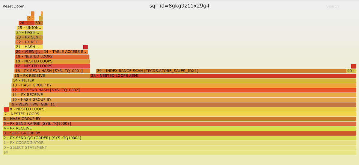
^ In the above example the majority of time has been spent in plan operation “14 – FILTER and under”. Apparently the 15 – PX RECEIVE branch is driving this filter and IN/EXISTS probes are done into the plan operation 38 – NESTED LOOPS SEMI that in turn spends most time “waiting” for its child operator 39 – INDEX RANGE SCAN retrieving records from the STORE_SALES_IDX2 index.
I’ll paste some more examples here so you can have fun reading them:
^ There’s no single obvious troublemaker operation in the query above, but the FlameGraph gives a nice overview of in which execution plan branches most of the time is spent — looks like half of all time is spent in SORT UNIQUE operations (15,31,47) and their children doing hash joins and full table scanning. Why do we have SORT UNIQUEs – looks like due to this query using the INTERSECT keyword somewhere in it (13, 14).
^ This last query seems to be quite a straightforward one with lots of repeated subqueries all using around the same amount of time.
Summary
This article hopefully serves two purposes. First, it introduces a new way for applying FlameGraphs for visualizing RDBMS SQL execution plan response time and resource usage at the plan operator level, while still maintaining the ability to see the big picture at a glance even with very large plans.
And second, it illustrates the fact that a typical RDBMS SQL plan execution is just a bunch of function calls executed in the hierarchy and order that’s defined in the plan itself. It’s very much similar to how regular applications loop through subroutines in their modules, thus the FlameGraph stack trace visualization mechanism can be applied without any modifications needed.
I wrote a proof-of-concept script for extracting Oracle SQL plan timing and formatting the output in the flamegraph.pl friendly format and you can download it here (sqlflame.sql). It’s a prototype, you probably need to read it to understand what it needs to work. And as mentioned above, Brendan’s FlameGraph introduction is here.
Update: As people have asked to see the raw input file processed by flamegraph.pl, I’ve uploaded it here.
Comments are currently in Twitter / X.
Watch Tanel’s talk from P99 CONF
Here’s a look at what Tanel presented at P99 CONF 23…
I will be introducing a new open source eBPF tool for efficiently sampling both on-CPU events and off-CPU events for every thread (task) in the OS. Linux standard performance tools (like perf) allow you to easily profile on-CPU threads doing work, but if we want to include the off-CPU timing and reasons for the full picture, things get complicated. Combining eBPF task state arrays with periodic sampling for profiling allows us to get both a system-level overview of where threads spend their time, even when blocked and sleeping, and allow us to drill down into individual thread level, to understand why.


